2014, the year of weddings.
This year started off with an email from Melody & Matt,
(no joke, timestamp: January 1!!)
re: their wedding stationary
thus began a very quick month of back and forth emails,
drafts, printer quotes, prints printed, and so on.
it was SUCH a fun, creative team effort.
---
so y'all...
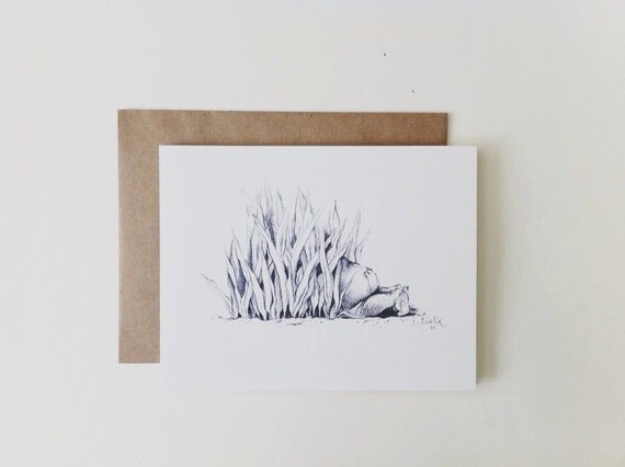
this here is my very first wedding stationary "set"!
a little snippet of Melody's Pinterest board:
peach + mint + gold
very pretty and chic.
designs began with brush lettering/calligraphy
here's a little mood board with all the finished elements:
1. Brush calligraphy + a little bit of type: Neutra Text
(the 'Sawasaki' last name is so fun to write)
2. Watercolor washes: so pretty, chic, light and airy
3. Hand drawn lace as a special design addition
4. and the illustrated golden chicken for the entree selection
with all that, you get some of this digitally mocked-up goodness:
And with some gold Baker's Twine and a little tag,
thee finished product:
in addition to the invitations,
Melody had asked me to letter up the guest place cards and table numbers
the amazing venue, ahhh:
(image via Tritia Lau)
for those table cards, gold was definitely the way to go..
that, with some opaque white. um, BUENO!
and what they looked like, day of:
(image via Tritia Lau)
Matt & Melody,
you guys were such a dream to work with (i'm not sugar coating),
love your style, organization, and love your love.
really.


.jpg)


